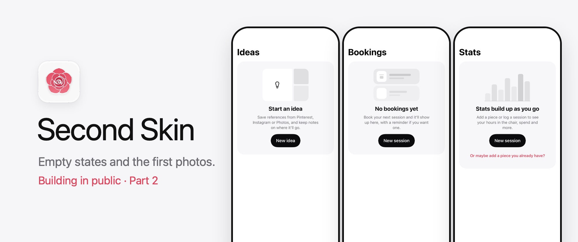
Building Second Skin in public #2: empty states and the first photos 📸
Gooood evening 👋. If you read one of my last posts, you’ll know I’m building Second Skin, an app for keeping track of your tattoos, and that I promised the odd update along the way. Well, here’s the next one.
At the end of that post I said the Collection tab was next. That’s… sort of what happened. I took a little detour first, and then made some pretty good progress on getting the base layers in for the other tabs. Let me show you where I’m at.
Last time there were 18 merged pull requests, now there are 26. It might not sound like much but it’s some pretty nice progress. Since the last update I’ve:
- Moved the shared bits (icon rows, the primary button and the empty state) into the design system.
- Built an empty state for Ideas, Bookings and Stats, so every tab now has one.
- Added a photo importer.
- Started the Add a piece sheet, with photos going in and out of it.
🧱 A detour into the design system
Before I touched the Collection grid I wanted the shared pieces in place. Welcome, About you and Collection had all ended up with their own version of the same row (icon on the left, title and a line of text, pretty standard stuff), and they’d slowly drifted apart: some icons were 36pt and some were 40pt, some were centred and some sat at the top. Not a massive problem, but a drift nonetheless.
One thing about personal projects is that you always start with your best intentions at heart but then you end up with code that has a lot of duplication just due to how you are working. At least for me, my personal projects are an escape from the rigidity of working on large scale apps, but that doesn’t mean we should let our codebases get into disarray. Especially with AI now I didn’t want to keep hacking away at different things and end up with something that was honestly going to be a nightmare to sort out. So I opted to stop and just get the fundamentals down first.
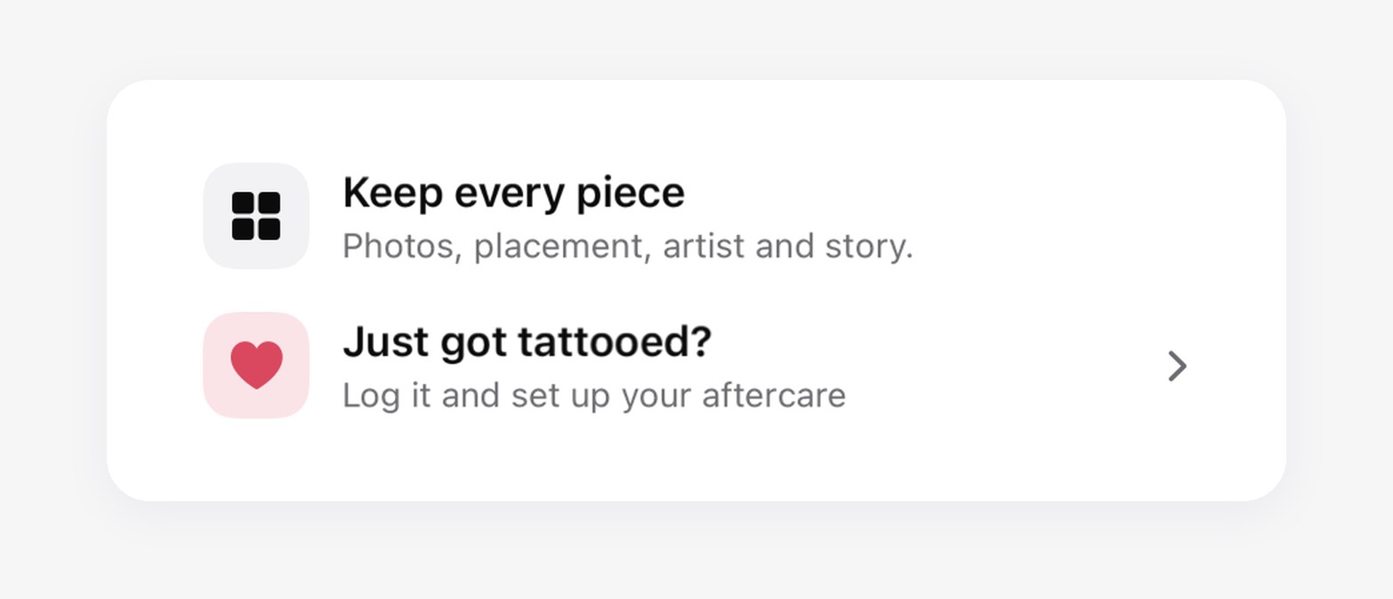
Taking you back to the example I mentioned earlier. This row I had became the IconRow which will be useful on a multitude of screens throughout the app. While I was at it I also shifted over the main button I’d used in the app to be the PrimaryButton and then the EmptyState followed so it could be re-used on the other pages.
 One
IconRow, plain and tappable.
Having the help of Claude here was pretty handy as I managed to do the main bulk of the shifting and sculpting and then Claude helped me with getting some snapshot testing and documentation in place so when I do code reviews it can prompt me if I’ve forgotten to reuse something that I’d made earlier.
One thing I picked up while moving the button over was that I’d made its label a plain String, which means it would never get translated.
💡 Tip:
Text(someString)with aStringshows the text as it is and never looks it up for translation. If you’re building a reusable component, take aLocalizedStringKeyfor the label instead.
I set a rule when I was doing the initial project discovery that I’d aim to shift something into the design system when it needed to be used in more than one place. You may now be thinking, “but Andy, you only had one empty state so far, so why did you move it now?” You are right, but honestly I opted to make the empty states consistent and I just thought it was easier to shift it all now.
🫙 An empty state for every tab
When you first open Second Skin, every tab is empty, so the empty states are really the first thing anyone sees other than the onboarding. They all follow the same pattern: a faint grey preview of what the tab will look like, a title, one line explaining it, a black button and sometimes a pink link underneath. This may change, but honestly this is what I have now and I’m fairly happy with it.
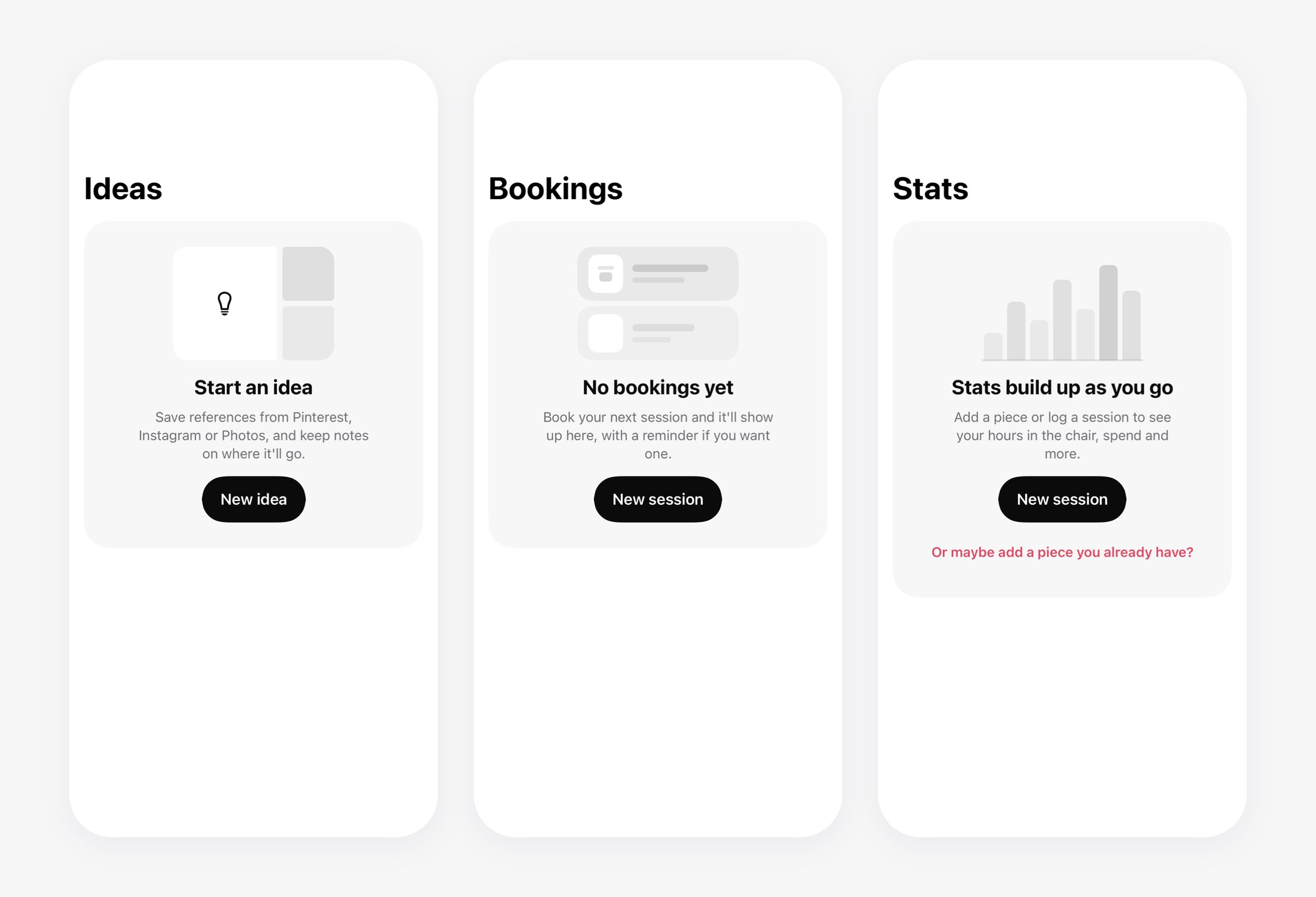 Ideas, Bookings and Stats, before you’ve added anything.
A few of them changed a bit from the designs once I actually built them:
- Ideas lost its “Suggest ideas for me” link. Suggestions are going to use Apple’s on-device model, and that’s planned for v2, so it didn’t make sense to show a link to something that doesn’t exist yet.
- Bookings originally promised “a reminder the day before”. Reminders aren’t built yet, you’ll be able to turn them off and I haven’t decided on the timing either, so now it just says you’ll get a reminder if you want one.
- Stats swapped “Log a sitting” for a link to add a piece you already have. A new session only counts towards your stats once you’ve logged how it went, so adding a piece you already have is the quicker way to see something there.
Large text broke everything (a little)
Every screen gets snapshot tests at the biggest accessibility text size, and the empty state didn’t hold up very well initially. The title went left aligned when it wrapped, the message was squashed into a narrow column and the “Add a piece” button wrapped onto two lines inside its capsule. The pictures also had fixed sizes, so they stayed tiny while the text around them got huge.
Now the title stays centred, the button fills the width at those sizes and the pictures scale with the text using @ScaledMetric. Every picture shares one little property wrapper for that, PictureScale, so I’m not copying the maths into each screen.
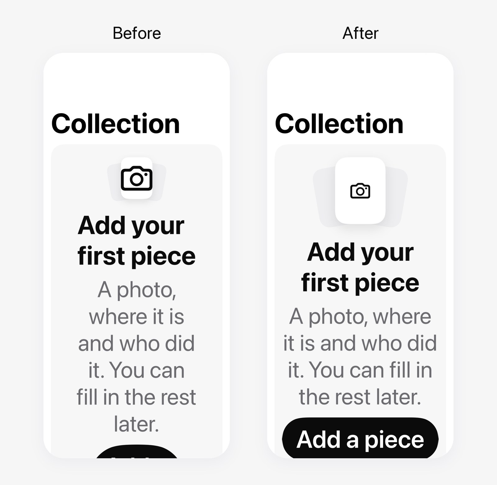 Collection at the biggest text size, before and after.
💡 Tip: If you use SnapshotTesting, adding
TEST_RUNNER_SNAPSHOT_TESTING_RECORD=failedto yourxcodebuildcommand re-records only the snapshots that failed, without changing your scheme. It’s really handy when you’ve made a change on purpose.
📸 The first photos go in
Then onto the bit I said I’d do last time, adding a piece. I split it into two parts, so I’ll do the same with the write up. First was the photo importer and then the sheet itself.
The photo importer
This is the part that takes a photo you’ve picked and gets it ready to save. Claude wrote this one while I worked on the sheet as to be honest, I was quite happy to offload the image handling.
When a photo comes in, it:
- Gets downsized to a 2048px HEIC, plus a 400px thumbnail for the grids.
- Has all of its metadata stripped, including location. The app is private by design, so I don’t want where you got tattooed syncing around with your photos.
- Gets a suggested colour for the piece’s little colour dot, picked from the photo. Black and grey work doesn’t get a colour at all, on any skin tone.
It all runs off the main actor, so the app doesn’t hang while it’s working through a big batch of pictures.
The Add a piece sheet
This was the part I was looking at most, as I think the usability of this screen will make or break the app for a lot of people. The idea is that the top is a photo picker, once you pick images you get one nice cover photo which will be used for the piece once it’s in the app, you can then add more pictures which show in a smaller carousel under the main cover. The picker section also has re-ordering, so you can choose to shift something else to be your cover photo if you find a better image of your piece later down the line.
This sheet’s been quite tricky and honestly just image handling and uploading took quite a chunk of my time, so I’m still actively working on the other aspects of the page, but I look forward to sharing more of it with you next time.
🧠 Things I learned
.task(id:)restarts when its id changes. I was clearing the picker selection inside the task, which changed the id and cancelled the import halfway through..onChangewith aTaskfixed it.- With
NonisolatedNonsendingByDefaulton, a plainasyncfunction runs on the caller’s actor. If you want it off the main actor, mark it@concurrent. @Observableneeds@ObservationIgnoredon every property wrapper, especially important when using Swift Dependencies like I am.- Shapes fill whatever space they’re offered. A
RoundedRectanglewith only a width will happily grow to the full height, which made for some very tall “lines of text” in the Bookings picture. 😅- This app is one of the first apps I’ve truly tried to build for iPhone, iPhone Duo and iPad, and also support localisation, accessibility, basically everything. So I’ve been learning a lot about the structure of my views and how to best handle things like widths and heights.
🔜 What’s next?
Next up is finishing the photo carousel: a message for when a photo can’t be added, and a limit on how many you can add in total. Then the rest of the sheet, name and placement, style, colour, the optional history section and finally saving.
There are a few decisions to make before I get there, like how you describe placement (an area plus front or back, or left and right as well?), what colour a black and grey piece gets, and what the minimum is before you can save.
If you’ve got tattoos, I’d love to know how you’d describe where one is, is “left forearm, inside” enough or would you want something more specific? Let me know in the comments. 👇🏻
Thanks for reading! If you’d like to leave a comment, this post is also on dev.to. For more, you can subscribe with RSS or follow me on dev.to.